A striking, efficiently designed website is a keystone for any successful manufacturing company. It provides credibility to your business, serves as a comprehensive resource for product/service information, and is an essential platform for engaging potential customers and streamlining your sales process.
Manufacturing websites often require detailed and technical information. Yet, balancing this need while maintaining a user-friendly, easy-to-browse interface can be a challenge. At CyberOptik, we understand this and specialize in developing websites that make complex product databases easy to navigate and search.
One of the best ways to start your website redesign process is by looking at standout examples in your industry. In this post, we’ve curated a list of top manufacturing websites that excel in several key areas: user engagement, ease of use, clarity of product information, and seamless product search and filtering.
Examples of the Best Manufacturing Website Designs
-
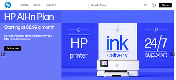
- HP Company: As an iconic American manufacturer of software and computer services, Hewlett-Packard’s website expertly showcases its products, services, and corporate endeavors. The website’s structure enables users to explore various product categories and compare models and specifications easily. Boasting user-friendly navigation, clear presentation, and a focus on historical successes, HP’s site positions the company as a dependable and competent partner for businesses requiring manufacturing solutions.
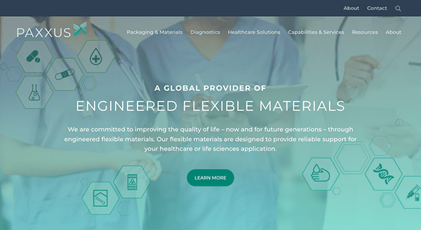
- PAXXUS: PAXXUS, a leading global supplier of engineered flexible materials for healthcare, exemplifies its dedication to the complex regulatory requirements of its industry on its website. The homepage is intuitively designed and conveys a sense of precision, cleanliness, and care. With an easy-to-navigate menu featuring products, diagnostics, healthcare solutions, and corporate information, PAXXUS effectively communicates its commitment to improving quality of life through engineered flexible materials.
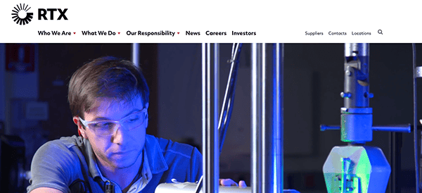
- Raytheon Technologies Corporation: Raytheon Technologies Corporation, an American multinational aerospace and defense conglomerate, successfully portrays its high-end products through a video slider on its homepage. The intuitive navigation menu allows users to access various sections, including “Who We Are,” “What We Do,” “Our Responsibility,” “News,” “Careers,” “Investors,” “Suppliers,” “Contacts,” and “Location” easily, ensuring information can be found effortlessly.
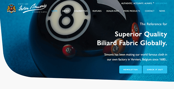
- SIMONIS CLOTH: Simonis Cloth, with a long history of producing superior quality cloths for pool and billiards tables since 1680, offers a visually appealing and professional website. The design, featuring an uncluttered layout and tastefully chosen color scheme, allows visitors to focus on the products. Sections such as Products, Company, Installation, and Care are easily navigable, ensuring quick access to the desired information.
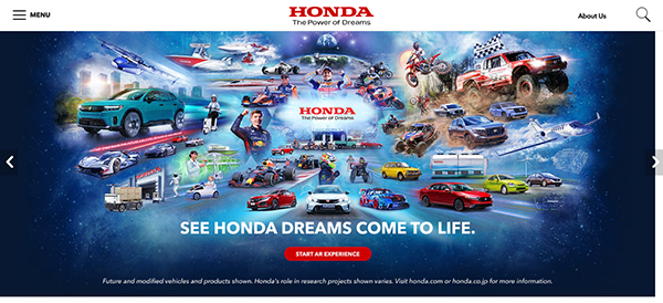
- Honda: Honda’s website, harmonizing with their slogan “Honda, The Power of Dreams,” showcases modern and visually striking images. The site’s smooth and quick navigation allows users to explore their extensive product lineup, including cars, motorcycles, and power equipment, offering a fresh perspective on the company’s advancements.
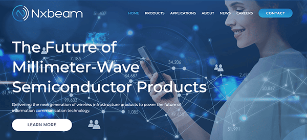
- NXBEAM: The NXBEAM website captivates with its sleek, modern design and engaging information about its expertise and services. The site stands out for its user-friendly functionality and swift loading times, ensuring an exceptional browsing experience that mirrors its promise of high-performance service.
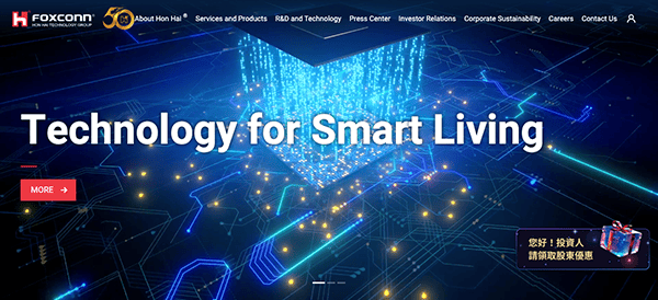
- FOXCONN: FOXCONN, a leading technology manufacturer, impresses with an innovative website featuring a stunning image carousel and auto-looping high-quality videos. The site efficiently delivers information about the company’s products, services, and corporate activities in a visually pleasing and organized layout, offering a seamless browsing experience.
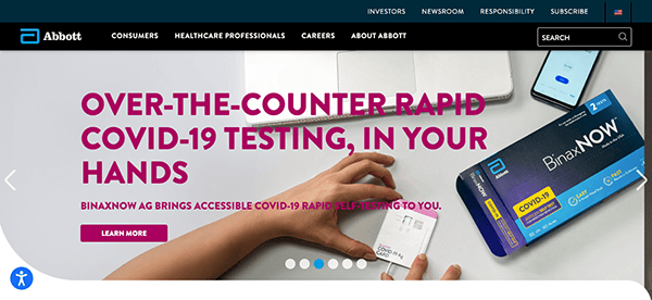
- ABBOTT: Abbott’s website is striking in its simplicity and efficiency. It provides information about the company and its products in a streamlined design that’s easy to navigate. The consistent use of white space and a unified color palette creates a sense of professionalism. The well-organized menu structure and the latest news features ensure a smooth browsing experience.
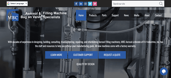
- MBC Aerosol: MBC Aerosol’s website effectively highlights its aerosol products in a well-organized layout. The site offers an intuitive menu structure and well-written content, alongside high-quality product images that showcase MBC Aerosol’s offerings. This approach ensures that whether you are a new visitor or a long-time customer, you can find the information you need quickly and easily.
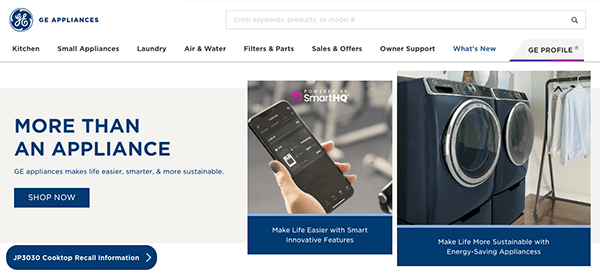
- GE Appliances: GE Appliances’ website is an excellent example of a user-friendly, well-structured, and visually appealing online presence. The site does a fantastic job showcasing their wide range of home appliances with high-quality images and detailed product information. Users can effortlessly navigate through the different sections, locate service and support options, and explore the latest product innovations.
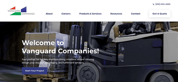
- Vanguard Packaging: Vanguard Packaging’s website impresses with its vibrant design and a clear depiction of its innovative packaging solutions. The site delivers comprehensive information about the company and its offerings in an easily navigable layout, supplemented by engaging visual content and straightforward descriptions.
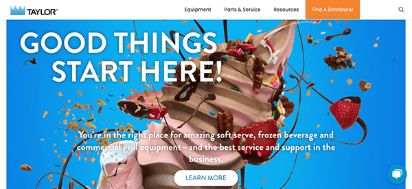
- TAYLOR: Taylor’s website successfully showcases the company’s expertise in food service equipment with an aesthetically pleasing, intuitive design. The high-quality images, informative descriptions, and easy-to-navigate layout give visitors a quick understanding of the company’s product offerings and commitment to quality.
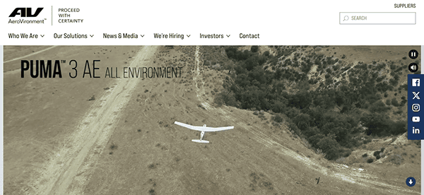
- AeroVironment, Inc.: AeroVironment, Inc., an American technology company known for its unmanned aircraft systems and tactical missile systems, offers a website that’s visually engaging and packed with information. The clear, structured design makes it easy for visitors to learn more about their wide range of products, and the “News & Events” section keeps users updated on the company’s latest developments.
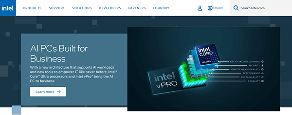
- Intel: The Intel website is an example of a clean and organized website that effectively represents its brand. The site is well-structured and makes it easy for users to find the information they’re looking for, whether it’s about products, support, or company information. Additionally, the high-quality imagery and videos provide a more engaging browsing experience.
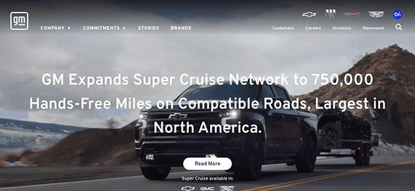
- GM (General Motors): The GM website stands out with its sleek, modern design, showcasing its vehicles beautifully with high-resolution images. The navigation is easy to use, allowing visitors to explore the range of vehicles, learn about innovations and technologies, and understand the company’s commitment to a more sustainable future. The site also has a comprehensive ‘Investors’ section, providing easy access to relevant financial information.
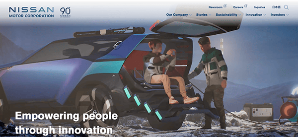
- Nissan Motor Corporation: The Nissan Motor Corporation’s website provides a clean, visually pleasing online presence. The company’s latest models and initiatives are prominently displayed, supported by engaging visuals. With well-structured navigation, visitors can easily learn about the company, its vehicles, and the technologies behind them.
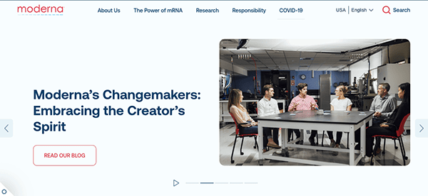
- Moderna, Inc.: Moderna’s website is clean, modern, and information-dense, providing extensive knowledge about its innovative mRNA technology. With sections detailing their research platforms, development pipeline, and news updates, the site offers a comprehensive look into their scientific pursuits.
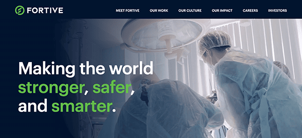
- Fortive Corporation: Fortive Corporation’s website is sleek and well-organized, offering easy navigation through its various sectors. The site provides comprehensive information about the company’s business units, commitment to corporate responsibility, and investment opportunities.
- TSMC (Taiwan Semiconductor Manufacturing Company): TSMC’s website is clean and professional, offering a wealth of information about the company’s technologies and services. It provides an intuitive navigation structure, allowing users to easily find information about their production processes, sustainability efforts, and recent news updates.
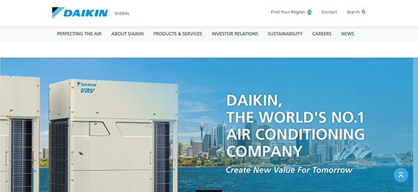
- Daikin Industries, Ltd.: Daikin Industries’ website features a clean and simple design with comprehensive information about their air conditioning and refrigeration systems. The site is user-friendly and well-structured, offering easy navigation to explore their product offerings, technologies, and corporate information.
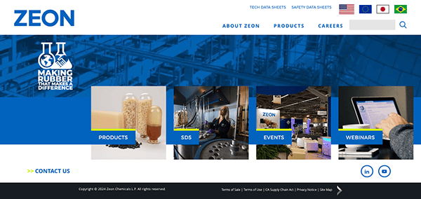
- ZEON Chemicals: ZEON’s site exudes sophistication through its crisp design and engaging graphics. With an intuitive structure, it offers an excellent choice for industrial consumers. The contemporary and minimalist website design accentuates user experience. Extensive product data is conveniently available, serving as a significant asset for prospective clients. Additionally, it provides an all-encompassing resources segment, offering supplementary details and aid to its visitors.
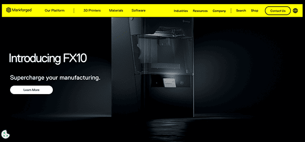
- Markforged: Focusing on its customer-centric value proposition, this 3D manufacturing site impresses with high-quality imagery and intriguing narratives. The knowledge repository simplifies the understanding of 3D printing fundamentals. Prioritizing user experience, it boasts simple navigation and exhaustive product specifics. The website’s 3D images not only exhibit their product range but also visually elucidate the intricate 3D printing procedure.
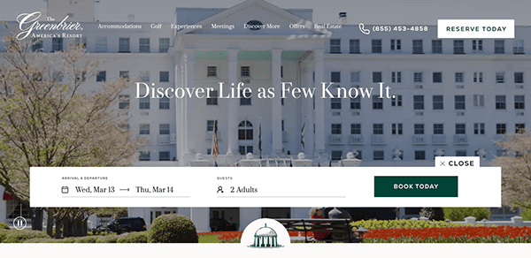
- Greenbrier: With a succinct explanation of specialized transport services, Greenbrier’s website effectively communicates its value proposition. It includes a dedicated careers section emphasizing its proactive stance on diversity and inclusion. The user-friendly website design makes information retrieval a breeze. The careers page stands out, demonstrating the firm’s commitment to promoting workplace diversity and inclusion.
- Fairlawn Tool Inc.: Compatible with both mobile and desktop, Fairlawn Tool’s website adjusts seamlessly. It promptly outlines the organization’s identity and services, presenting a compelling rationale to consider their contract metal manufacturing solutions. With user experience at the forefront, navigation, and information sourcing are straightforward. An exhaustive resource segment enhances the website, offering extra data and support to visitors.
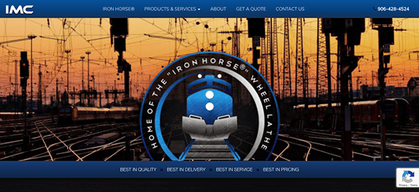
- Independent Machine Company (IMC): IMC’s website wastes no time in presenting its offerings. Interactive spool calculators and industry-specific product demonstration videos distinguish the site. Prioritizing user experience, it simplifies navigation and information sourcing. The calculators and video library are highlight features, supplying useful resources and assistance to users.
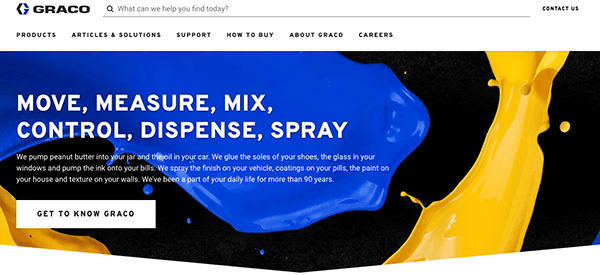
- Graco: Graco’s manufacturing sub-site streamlines product and service exploration for manufacturers. It offers easily accessible resources to maximize value from its product suite. User experience is a prime focus, with seamless navigation and ample information. The resources section is a notable addition, offering supportive information and assistance to users.
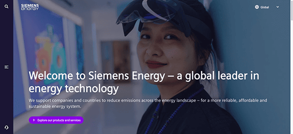
- Siemens Energy: Catering to power generation firms, oil and gas industries, and others requiring turbine services, Siemens Energy’s microsite adeptly displays specific offerings. With user experience as the priority, navigation, and information sourcing are effortless. The site further contains a comprehensive resources section, providing additional information and user support.
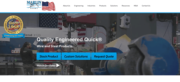
- Marlin Steel: With persuasive content and striking visuals, Marlin Steel’s site leaves a lasting impression. The potent value proposition precisely outlines their capabilities. User-friendly design facilitates easy navigation and information discovery. A thorough resources section enriches the website, offering supplementary data and user support.
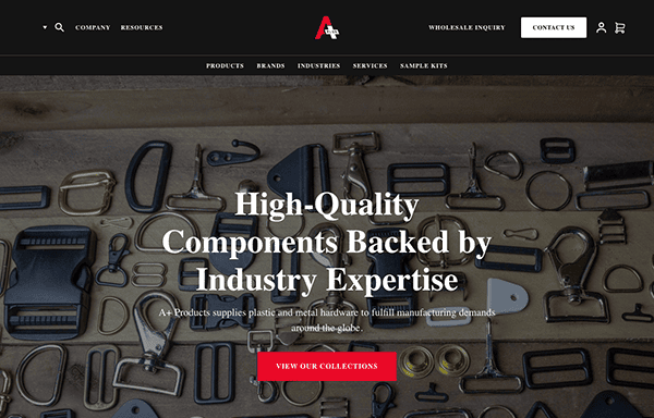
- A+ Group: A+ Group’s website is aimed at manufacturers seeking hardware solutions in metal and plastic. The company sets itself apart with its three-decade industry expertise. With a user-centered design, information access and navigation are straightforward. An inclusive resources segment enhances the website, offering extra data and support to users.
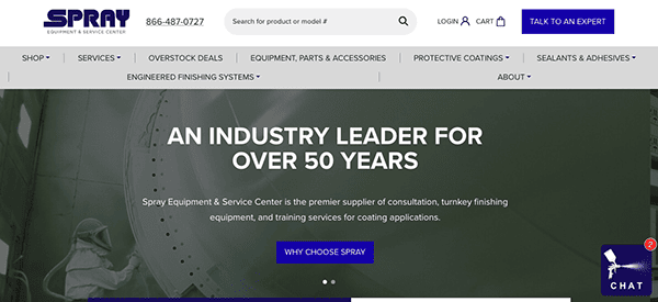
- Spray Equipment & Service Center: Spray Equipment & Service Center introduced an e-commerce website recently. This new site doubles as a corporate website and a user-friendly e-commerce platform. User experience is at the heart of the design, facilitating easy navigation and information sourcing. The e-commerce platform is a highlight, enabling users to purchase products directly.
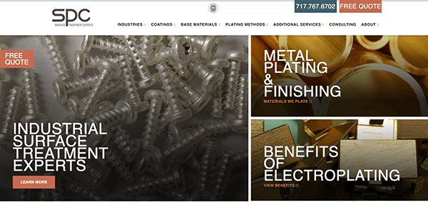
- Sharretts Plating: Sharretts Plating offers plating services to various sectors, including automotive and electronics. The website reflects its quality standards, enabling easy lead generation through visible contact forms and quote requests. Prioritizing user experience, the design simplifies navigation and information sourcing. The contact and quote request forms are highlight features, providing users with a convenient way to reach out.
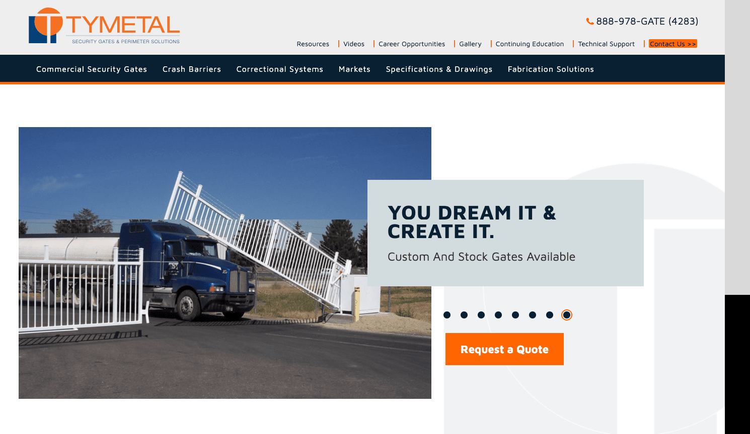
- Tymetal: Specializing in secure gate systems, Tymetal offers customers an array of suitable options. Their website emphasizes their industry experience and facilitates product browsing. With a user-centered design, information access and navigation are easy. A thorough resources section enriches the website, offering extra data and support to users.
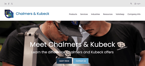
- Chalmers & Kubeck: As one of the largest independent machine shops in the U.S., Chalmers & Kubeck’s website features clear, well-structured navigation, making very easy for visitors to find what they need. Prioritizing user experience, the design simplifies navigation and information sourcing. A thorough resources section enriches the website, offering extra data and user support.
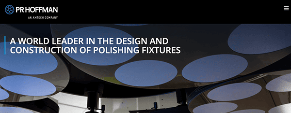
- PR Hoffman: PR Hoffman offers lapping and polishing machines to diverse industries. Their website emphasizes their quality commitment. With a user-centered design, information access and navigation are straightforward. A comprehensive resources section enriches the website, offering extra data and support to users.
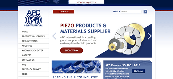
- APC International: Specializing in custom piezoelectric ceramic shapes and piezo devices, APC International’s website delivers detailed information about their capabilities. The user-friendly design simplifies navigation and information discovery. An extensive resources segment enhances the website, offering extra data and support to users.
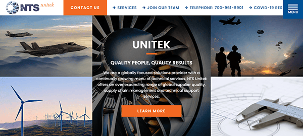
- NTS Unitek: With visually striking, high-quality imagery and an intuitive layout, NTS Unitek stands out among the top manufacturing websites. Prioritizing user experience, navigation, and information sourcing is straightforward. The site also contains a comprehensive resources section, offering additional information and user support.
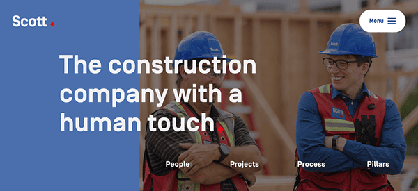
- Scott Construction Group: Centering its narrative around people, Scott Construction Group permeates its motto (“the construction company with a human touch”) throughout the website. The user-friendly design makes navigation and information sourcing effortless. An extensive resources segment enriches the website, providing additional data and user support.
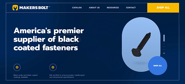
- Makers Bolt: Makers Bolt introduces a unique approach, making manufacturing attractive. With a minimalist design, the website emphasizes product simplicity. The user-centered design makes information access and navigation straightforward. An extensive resources segment enhances the website, offering extra data and user support.
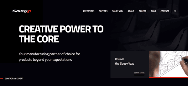
- Soucy Group: Designed with a specific audience in mind, Soucy’s website aligns aesthetics with business objectives. It immediately showcases diverse products, highlighting Soucy’s broad offerings. Prioritizing user experience, navigation and information sourcing are effortless. A comprehensive resources section enriches the website, offering extra data and user support.
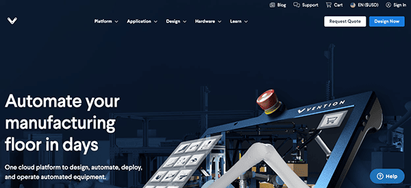
- Rapid Robotics: Merging robotics with video, the Rapid Robotics website communicates product benefits effectively. Using playful animations and real-world video snippets, it emphasizes ease of use, quick installation, and the tool’s power for assembly lines. With a focus on user experience, navigation, and information sourcing are easy. An extensive resources segment enhances the website, offering extra data and user support.
These websites raise the bar in manufacturing web design. They artfully blend detailed product information with intuitive navigation and efficient search and filtering processes to provide a seamless user experience. They clearly map the route to product/service discovery, making it easy for prospects to move from browsing to purchasing or making inquiries.
Just like these industry leaders, your company deserves a high-quality website that meets all your needs: straightforward design, easy navigation, clear calls-to-action, intuitive product search and filtering, and a backend that allows for effortless content updates.
At CyberOptik, we’re experts at creating websites tailored to the unique needs of manufacturing companies. We understand the technical complexities and large product databases common in this industry. That’s why we offer specialized services to handle expansive product databases and even eCommerce capabilities, all while maintaining optimal website performance.
Our goal is to ensure you get a top-tier website that looks professional and functions flawlessly to support your business goals. We combine aesthetics with functionality, creating a site that effectively communicates your product offerings, connects with your customers, and facilitates business transactions.
Contact CyberOptik today to discuss how we can collaborate to make your online presence as robust and efficient as your manufacturing operations. We’re eager to partner with you and help your business thrive in the digital landscape and stand out in the manufacturing industry.
